

About the Type Collection
The Mimi So Type collection is an homage to Mimi's graphic design roots. Her linear style of design adds a whimsical edge to the collection. Asymmetry highlights the playfulness of strict forms, while letters hang askew from their chains. Each sans serif letter references the clean lines of her iconic Piece collection and reflects her signature aesthetic of refined simplicity.

I Love Letters...
The Type collection is a nod to my days as a graphic design student. My most revered class during communications year at Parsons was Typography. I was constantly experimenting with typefaces until I found my own, linear aesthetic. The Bauhaus movement fascinated me the most. My favorite typographer, and the subject of my senior thesis, was Jan Tschichold, who played a major role in 20th century graphic design.
I believe that form follows function and I referenced this theory when I designed the Mimi So brand icon and logo as well as the Type collection of personalized jewelry. In Chinese calligraphy, the width and direction of a stroke express the meaning behind each movement. Letters, on the other hand, are a medium of expression achieved through the combination of adjacent letters. I love letters because they are expressive without sound, yet they carry volume. I felt so much freedom and joy creating the jewels for the Type collection and I marveled at how the unique stroke of each line created a new meaning. The playful initial necklaces in this collection are my whimsical take on a new classic to be worn every day. — XO MIMI
Behind the Scenes
The art of typography is central to Mimi So's design philosophy. As a student of graphic design at Parsons, Mimi adopted the techniques of this ancient artistry which aim to create written letters and words that evoke emotion and connection to their reader. She infuses this same ethos into her fine jewelry designs, modeling beautiful necklaces that inspire and touch the sentiments of the wearer.

In school, Mimi was drawn to the bold, graphic characters of her favorite typefaces. She understood the delicate balance between negative and positive space required to highlight their appeal. With this in mind, she went on to create her brand’s logo and icon. Her appreciation for the beauty of clean lines and the studied arrangement of angles informed the look of her debut jewels.
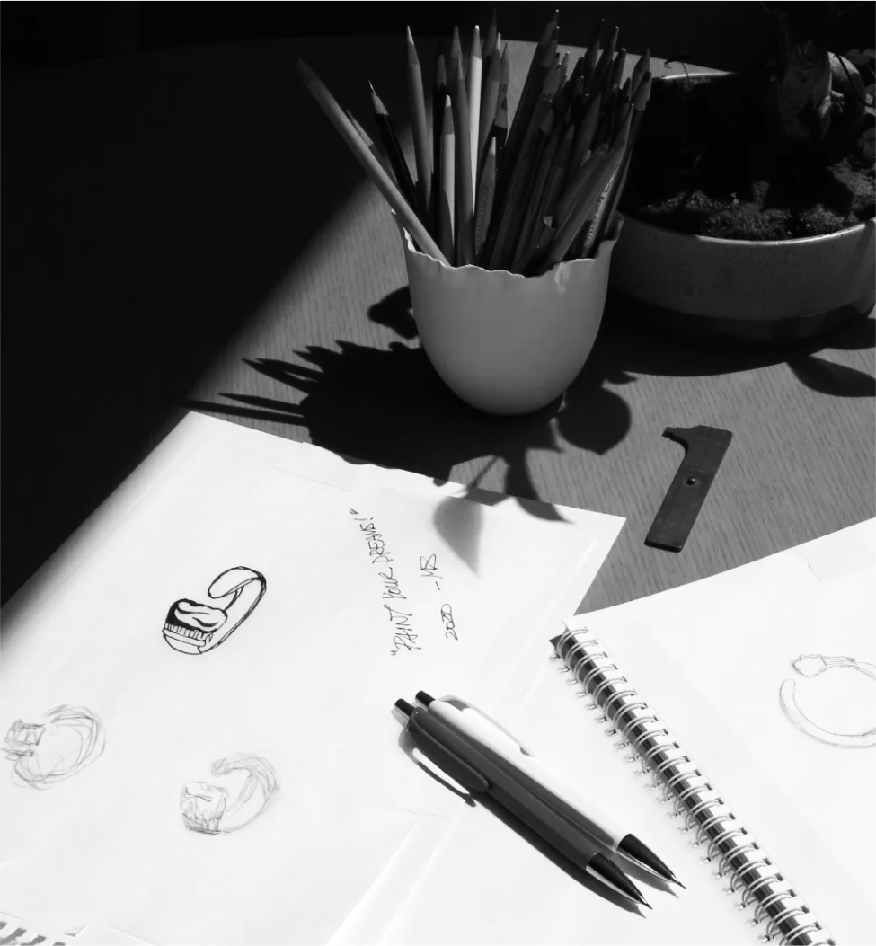
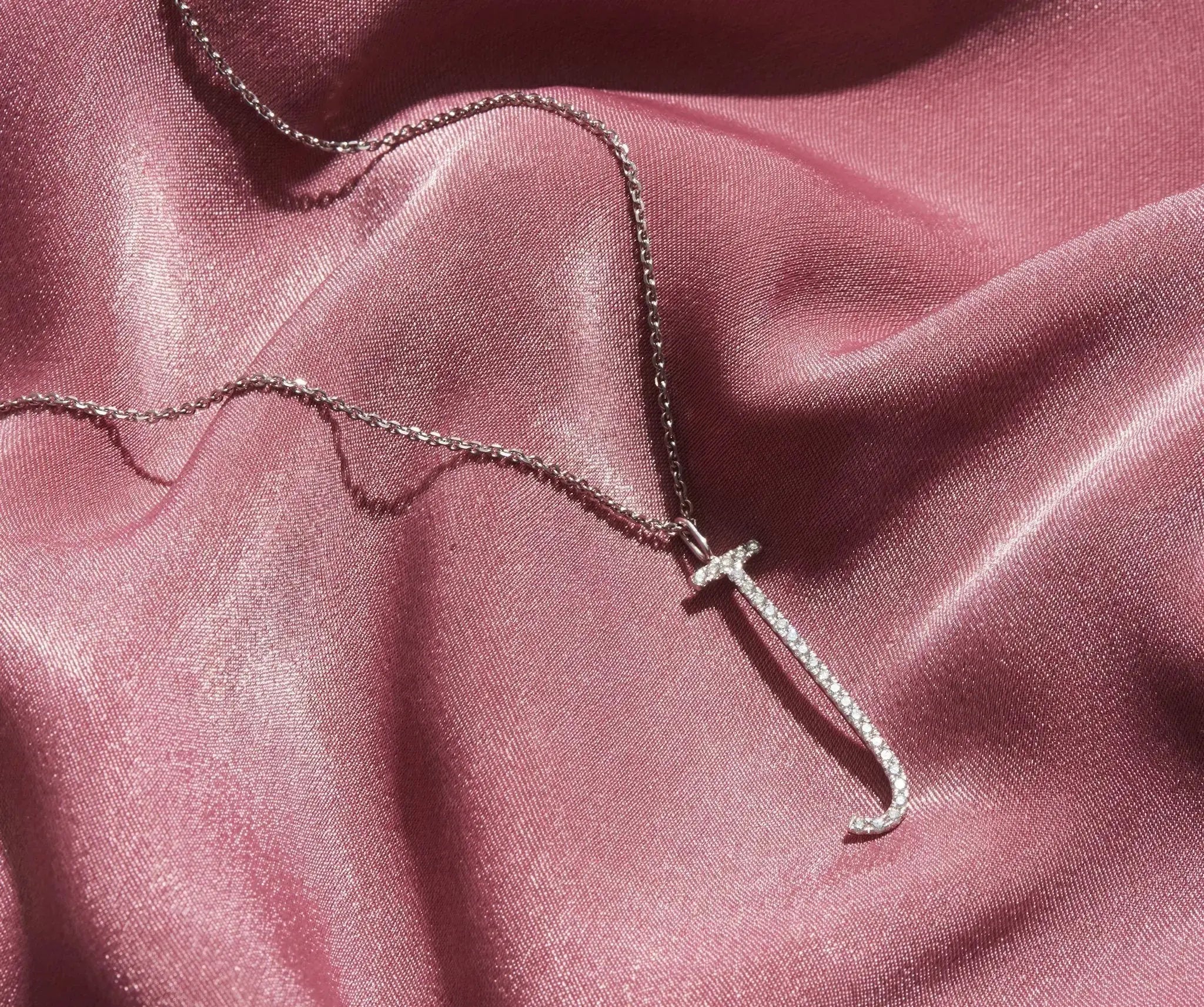
The glistening letters of the Type collection initial necklaces required much effort to calculate the correct amount of precisely sized diamonds for each letter in the alphabet — not an easy task as it calls for the exact measurement of each asymmetrically designed letter.
The team created the letter models first by hand, then in CAD for precision. It took three attempts at diamond arrangement patterns and sizes to achieve the balance that Mimi was looking for.
The letters require between 22 - 50 diamonds depending on their shape. The manner in which each letter hangs from the necklace was also carefully considered. Mimi sought to infuse a sense of playfulness into the pieces, evident in the asymmetry and the letters that hang slightly askew from their chains. Every angle and aspect of movement is carefully thought out throughout the collection.